DESIGN CONSIDERATIONS
There are a number of considerations to keep in mind when designing a logo you want embroidered.
Embroidery is not the same as printing. What looks good on a business card may not work for embroidery. DO NOT expect detail any finer than you can draw with a fine felt-tip pen (approx 0.4mm)
- Thread is of a standard thickness, approx 0.4mm. Tiny strokes for emphasis and small lettering are often not possible in embroidery.
- Frequent colour changes increase the probability for thread breaks during embroidery. When designing, try to draw the design without lifting the pencil from the paper for each colour. This is what we aim for when we convert the design to stitch format.
- Shading is easier to do in Screen printing and on paper than it is in thread.
- There is a limit to letter sizes. Lettering below 5mm seldom embroiders crisply. See below for more information.
- When sewing on a cap. Detailed outlining is often unsuccessful as the register is often lost in mid design. This does not happen when the embroidery is done before the cap is assembled, but this is only an option in quantities of 300 or more.
- When designing on a fabric with a pile or heavy texture eg Polar Fleece, Terry Towelling etc, thin lines can often sink into the fabric pile or texture.
- Not all stock designs are scalable.
- Small lettering, excessive detail or very small shapes don't lend themselves to reproduction in thread. They are difficult to work with, and don't look good on the finished product. Lettering should be at least 5mm high or taller to sew out best.
- An embroidered design is a special kind of graphic. It is made of thread instead of ink, so it has a different texture and sheen. In an area filled with stitches, there are about 64 threads in every 25mm. In graphic terms, that would be "low resolution." That means that artwork (especially subtle curves and feathery effects) needs to be emulated rather than reproduced.
LETTERING (in particular….SMALL LETTERING)
Not all fonts are suitable for embroidery. Small lettering; the minimum size we can embroider is 5mm in a block font. Most other lettering is best between 8 - 10mm. Due to difficulties in reproducing small lettering with thread we suggest the following for best results,
- Stroke width should be at least 1mm wide.
- Open areas in letters (a, e, g, etc) should be at least 1mm wide.
- Block style lettering must be at least 5mm in height.
- Serif style lettering be at least 6mm in height (see Figure 1)
Lettering to be sewn on pique (Lacoste Style Polo) or Polar Fleece garments should be 1mm larger than suggested minimums.
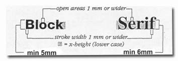
Figure 1
Due to variables such as tension, fabric type, needle size, backing etc results of lettering not meeting the above requirements are not guaranteed.
We receive many requests with lettering that is too small to sew well. We can digitise any size lettering; including lettering that is too small for anyone to sew clearly. We suggest you enlarge or reduce your artwork to the size you want it to be reproduced and compare it to the suggestions and illustrations above. If you discover a troublesome area, ask yourself, Can the entire design be enlarged? Can the small lettering be enlarged, edited or eliminated, or some combination thereof?
Please remember that we do this every day, so our suggestions come from experience. Generally our customers are very happy with our version of their designs. We know how to emulate the intended shape with thread so the final sewn image will give the same impression as the printed logo, even if it is significantly simplified.
Thread Colours on a colour sample card may look significantly lighter when they're sewn out, because of the sheen of the thread. A thread colour card has threads lying flat next to each other. A design sewn on fabric has stitches that pull down into the fabric, and take the shape of the garment. There are many more highlights on the sewn design, making it seem lighter.
If you require any further information or assistance please contact us.